new
Dec 7, 2022
📊 Huge improvements to chart blocks!
Charts are extremely important when it comes to fast exploratory analysis. For a better no-code data visualization experience, we have brought up our chart block capabilities to the next level 💪.
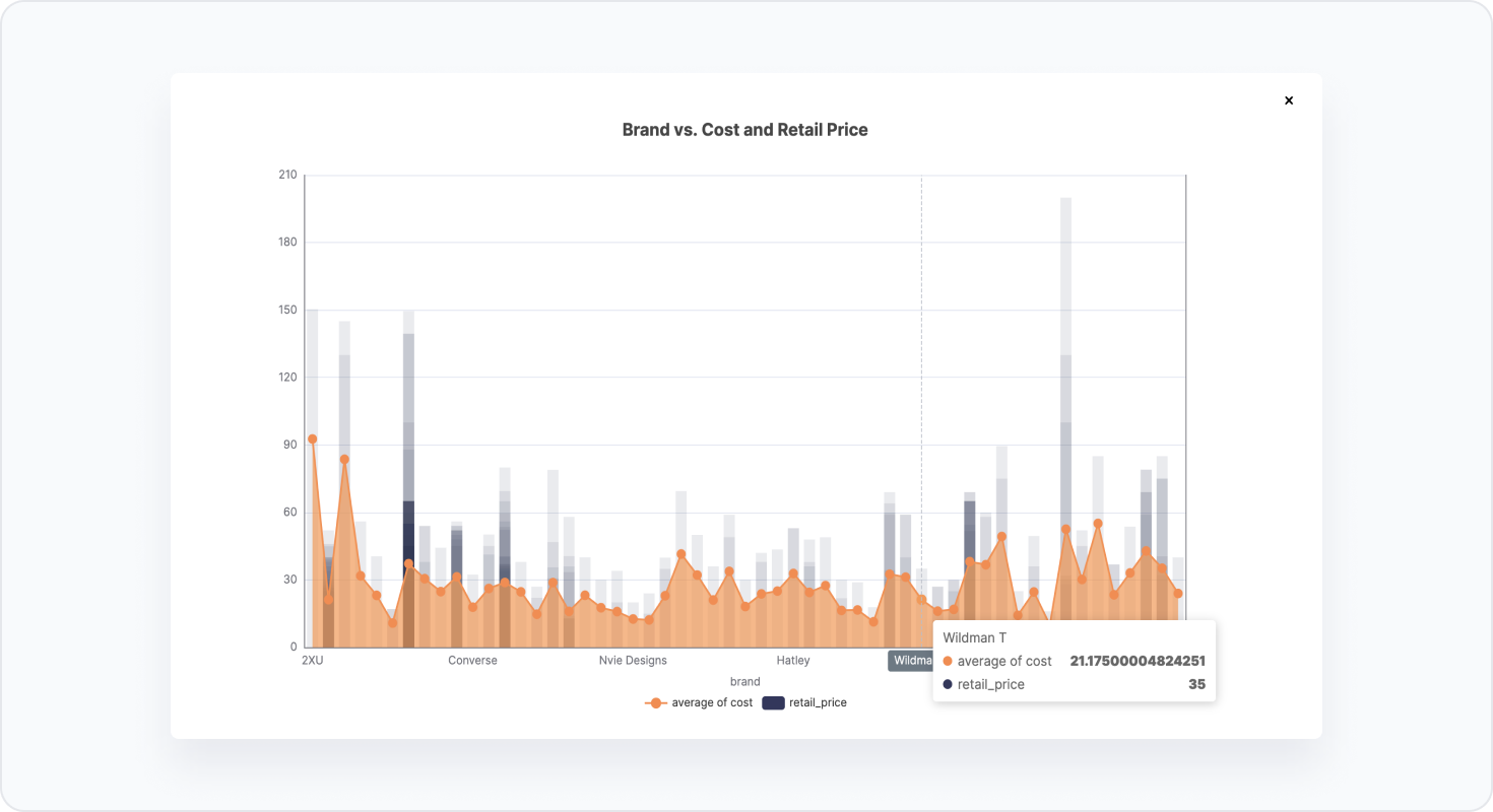
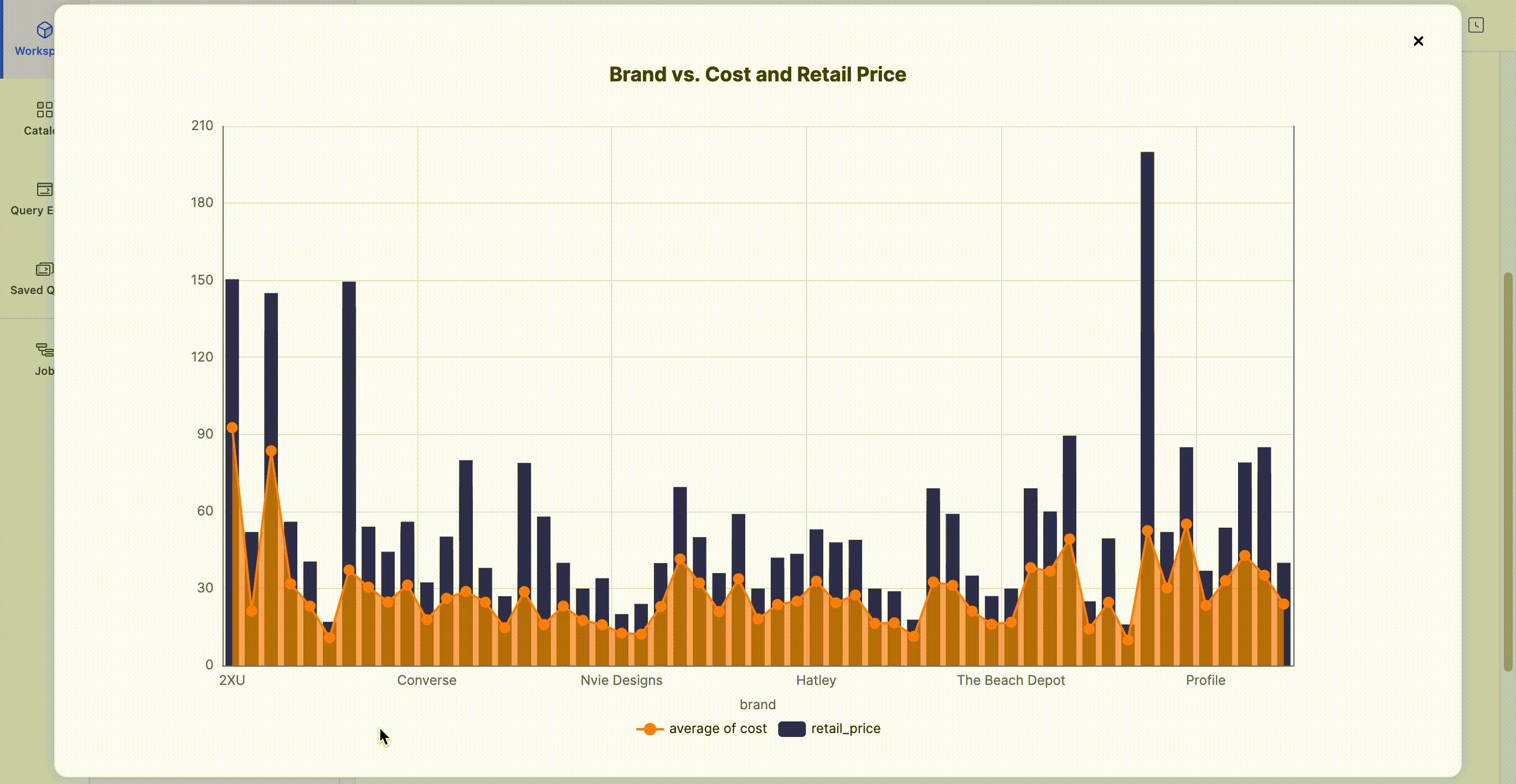
- More chart types- We've added horizontal bar, area, big number, and combined charts.
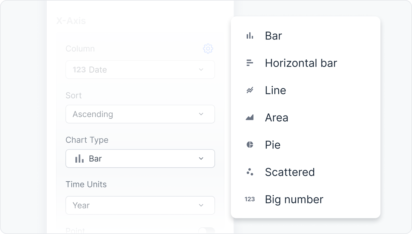 *To visualize your data as combined charts, add multiple y-axes as different chart types
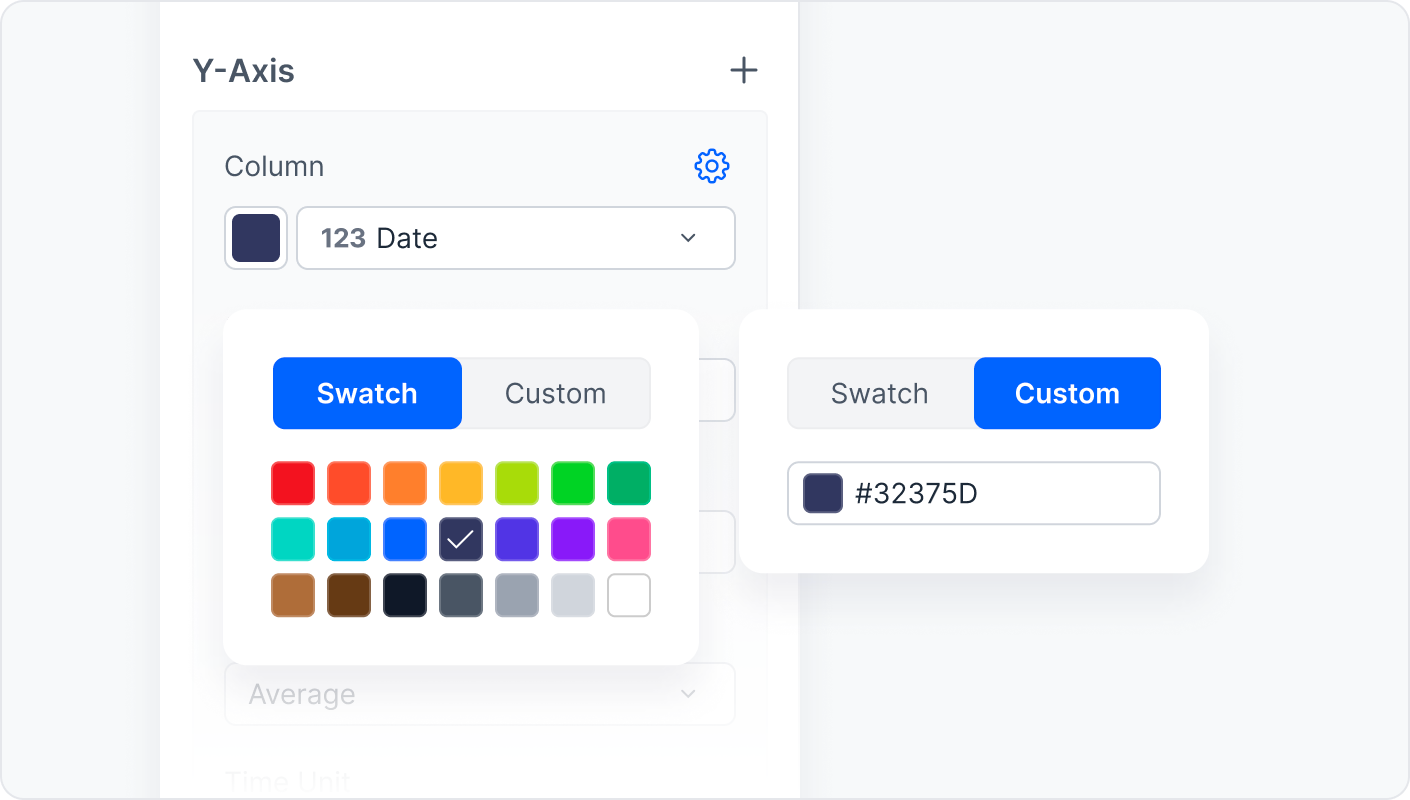
 - Use color to visually group your data- Make your data really stand out with colors!
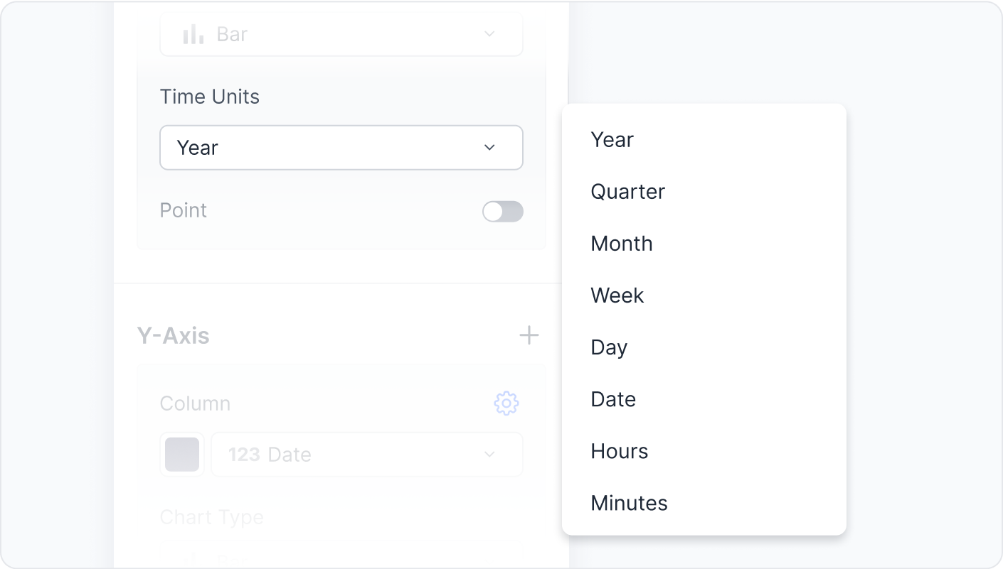
- Time units for charts with column typeDate- You can now group time units by Year, Quarter, Month, Week, Day, Date, Hours, and Minutes.
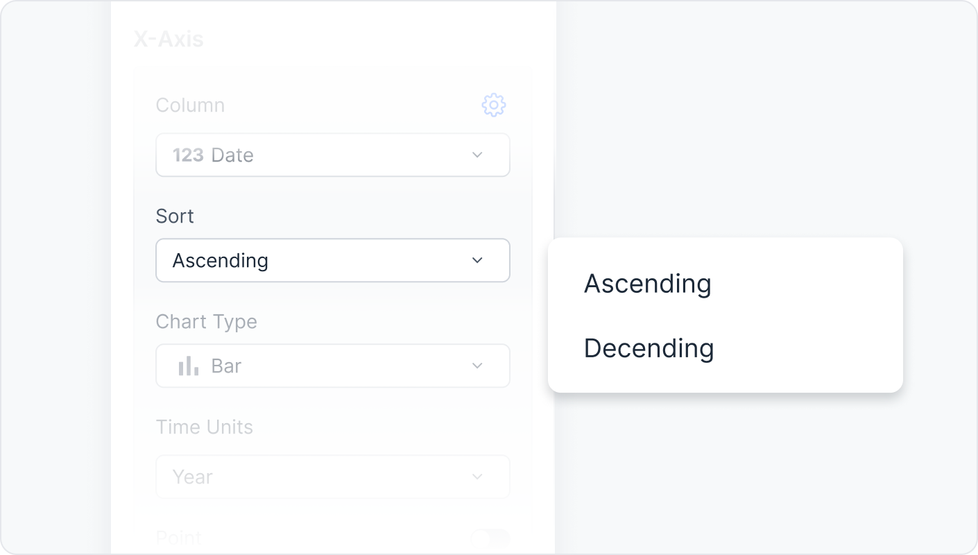
- Sorting by ascending or descending value- Sort the chart's x-axis by ascending value or descending value.
- Aggregation has finally come to charts- Once you add a column to an axis, you can apply aggregation functions. Generally, we support aggregation byCount,Max, orMin. You can use aggregation byAverageorSumif the column type is integer, float, or time.
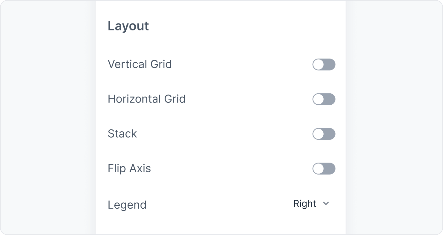
- More control over configurations- With this chart update, you have more control over configuration details such as value, legends, axes labels, etc.
-
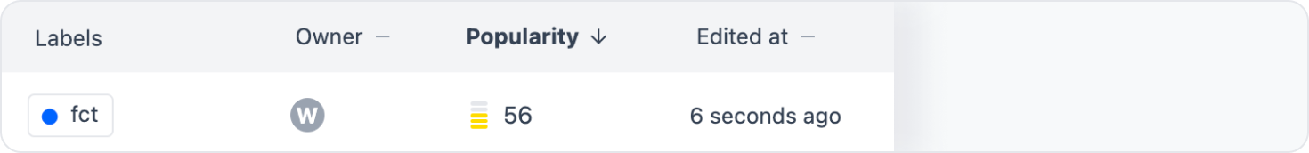
🤩 Popularity scoring
Too much assets making you dizzy? Don't worry, we've got you covered.
You can now order assets by their popularity amongst your team. Save time sifting through assets using popularity scoring to sort through long lists of pages, tables, and saved queries.
*
Popularity scorings in catalog tables are calculated by their query run frequencies and view counts. Popularity scorings in saved queries and workspace pages are calculated by their view counts.